Pablo Picasso
I have been off blogging for a little while due to... well... life. But I had a little fun and I documented that fun to share with you all! All my crafting was to try to create some new life for our house that seemed to become dreary over the course of the winter. Is my house the only one that does that?
I am so inspired by the beautiful blossoms of the crab apple trees outside my window, the bright yellow and pink of the tulips popping out of the ground and the gorgeous shade of spring green (which is my favorite) of the trees that line our street. My home needs color! The kind of color God created. Color that makes you sigh, relax and appreciate life in all its shades!
My first victim... my daughter's room! I went color overboard in her room! I converted her toddler room to what we now loving call the Big Girl Room. Out went the convertible crib and in came two matching antique twin beds soon to be painted a bright color of which I cannot decide. Her matching bedspreads are three shades of pink laced with green, orange and yellow in square patchwork designs. Of course these coordinated with the two shades of pink on her walls in horizontal stripes and checker board squares! The bed skirts are polka dot green and white and the compliment the polka dot pillows in brown and white. My favorite pillows are the green and white polka dots and yellow lemons! The fabric is adorable. Did I mention the pillow cases and bed sheets are aqua blue? Her room is very happy!
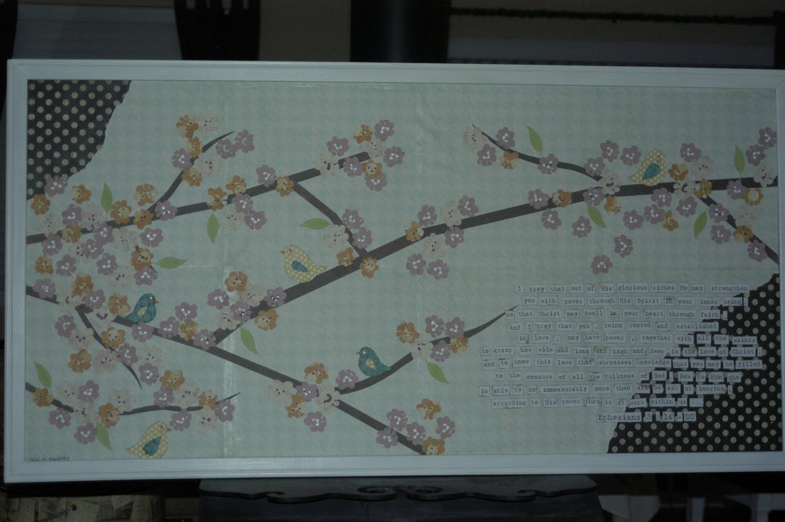
I honor of ALL the color in my sweet baby's (who often tells me "I'm not a baby!") room, she needed some artwork to tie it all together. I was inspired by many different types of children's artwork that I researched along with the blossoms on our crab apple tree. (And the blossoms are the only thing good about that tree!)
I found a huge, old (of course) cork bulletin board for $4 at Goodwill and I painted the frame white to contrast the pink of the walls.


Next blog: Pictures of the Big Girl Room!
One thing God has taught me through the process of loving color is that color doesn't have much meaning if you don't know the Source of its brilliance.
Have a color-filled day!
Sarah
No comments:
Post a Comment